This twelfth article of the mathematical journey through open source, shows the mathematical visualization in octave.
Mathematics is incomplete without visualization, without drawing the results, and without plotting the graphs. octave uses the powerful gnuplot as the backend of its plotting functionality. And in the frontend provides various plotting functions. Let’s look at the most beautiful ones.
Basic 2D Plotting
The most basic plotting is using the plot() function, which takes the Cartesian x & y values. Additionally, you may pass, as how to plot, i.e. as points or lines, their style, their colour, label, etc. Supported point styles are: +, *, o, x, ^, and lines are represented by -. Supported colours are: k (black), r (red), g (green), b (blue), y (yellow), m (magenta), c (cyan), w (white). With this background, here is how you plot a sine curve, and Figure 12 shows the plot.
$ octave -qf
octave:1> x = 0:0.1:2*pi;
octave:2> y = sin(x);
octave:3> plot(x, y, "^b");
octave:4> xlabel("x ->");
octave:5> ylabel("y = sin(x) ->");
octave:6> title("Basic plot");
octave:7>
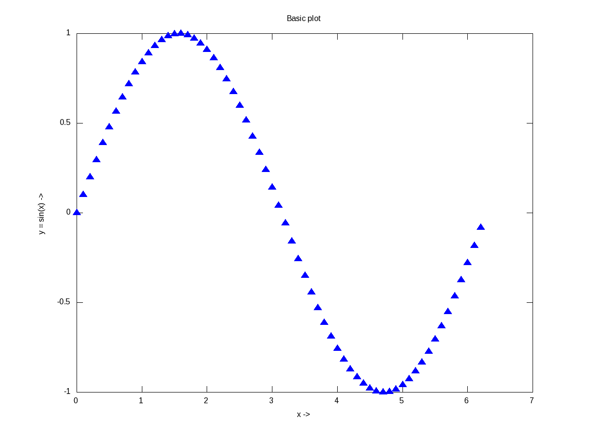
Figure 12: Basic plotting in octave
xlabel(), and ylabel() adds the corresponding labels, and title() adds the title. Multiple plots can be done on the same axis as follows, and Figure 13 shows the plots. Note the usage of legend() to mark the multiple plots.
$ octave -qf
octave:1> x = 0:0.1:2*pi;
octave:2> plot(x, sin(x), "*", x, 1 + sin(x), "-", x, cos(x), "o");
octave:3> xlabel("x ->");
octave:4> ylabel("y ->");
octave:5> legend("sine", "1 + sine", "cosine");
octave:6> title("Multiple plots");
octave:7>
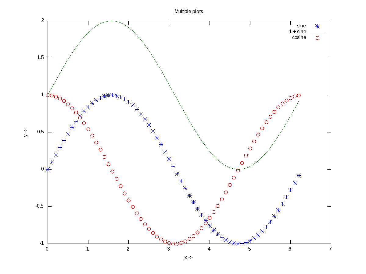
Figure 13: Multiple plots on the same axis
Advanced 2D Figures
Now, if we want to have the multiple graphs on the same sheet but with different axes as shown in Figure 14, here is how to do that:
octave:1> t = 0:0.1:6*pi;
octave:2> subplot(2, 1, 1);
octave:3> plot(t, 325 * sin(t));
octave:4> xlabel("t (sec)");
octave:5> ylabel("V_{ac} (V)");
octave:6> title("AC voltage curve");
octave:7> grid("on");
octave:8> subplot(2, 1, 2);
octave:9> plot(t, 5 * cos(t));
octave:10> xlabel("t (sec)");
octave:11> ylabel("I_{ac} (A)");
octave:12> title("AC current curve");
octave:13> grid("on");
octave:14> print("-dpng", "multiple_plots_on_a_sheet.png");
octave:15>
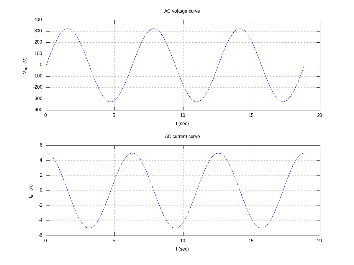
Figure 14: Multiple plots on a sheet
Note the usage of subplot(), taking the matrix dimensions (row, column) and the plot number to create the matrix of plots. In the example above, it created a 2×1 matrix of plots. As add-ons, we have used the grid(“on”) to show up the dotted grid lines, and print() to save the generated figure as a .png file.
It is not always easy to plot everything in Cartesian co-ordinates, or rather many things are easier to plot in polar co-ordinates, e.g. a spiral, circle, heart, etc. The following code & Figure 15 shows a few such examples. Shown along with is a technique of modifying the figure properties, after drawing the figure using the set() function. Here it modifies the line thickness.
octave:1> th = 0:0.1:2*pi;
octave:2> r1 = 1.1 .^ th;
octave:3> r2 = 7 * cos(th);
octave:4> r3 = 5 * (1 - cos(th));
octave:5> r = [r1; r2; r3];
octave:6> ph = polar(th, r, "-");
octave:7> set(ph, "LineWidth", 4);
octave:8> legend("spiral", "circle", "heart");
octave:9>
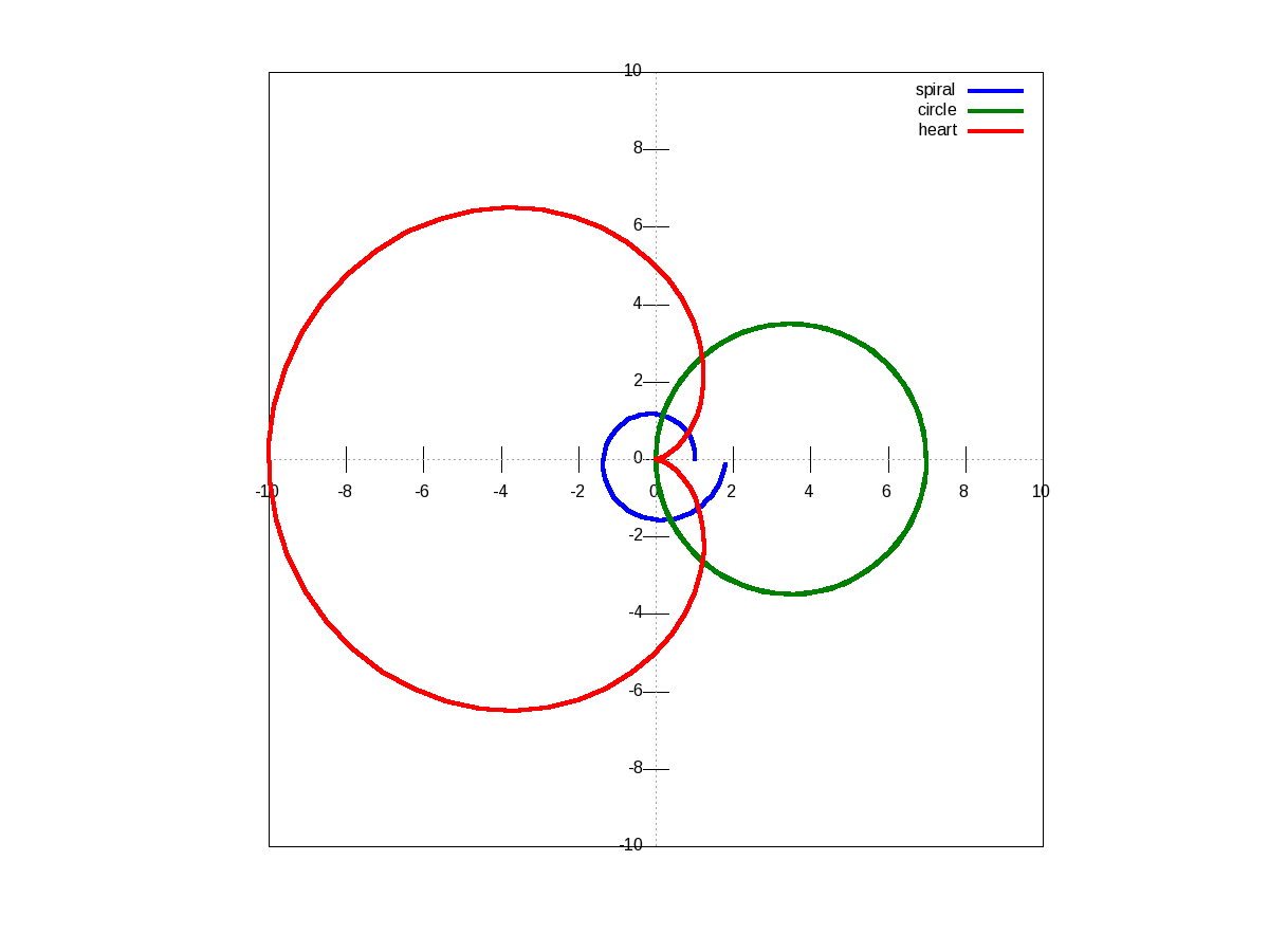
Figure 15: Polar plots
There are many other possible ways of drawing various interesting 2-D figures for all kind of mathematical & scientific requirements. So, before closing on 2-D plotting, let’s look into just one more often needed drawing – plotting with log axis, and more over with two y-axes on a single plot. The function for that is plotyy(). Note the plotyy() calling the corresponding function pointers @plot, @semilogy passed to it, in the following code segment. Figure 16 shows the output.
octave:1> x = 0:0.1:2*pi;
octave:2> y1 = sin(x);
octave:3> y2 = exp(exp(x));
octave:4> ax = plotyy(x, y1, x, y2, @plot, @semilogy);
octave:5> xlabel("x ->");
octave:6> ylabel(ax(1), "sine ->");
octave:7> ylabel(ax(2), "e^{e^x} ->");
octave:8> title("Mixed plots");
octave:9>
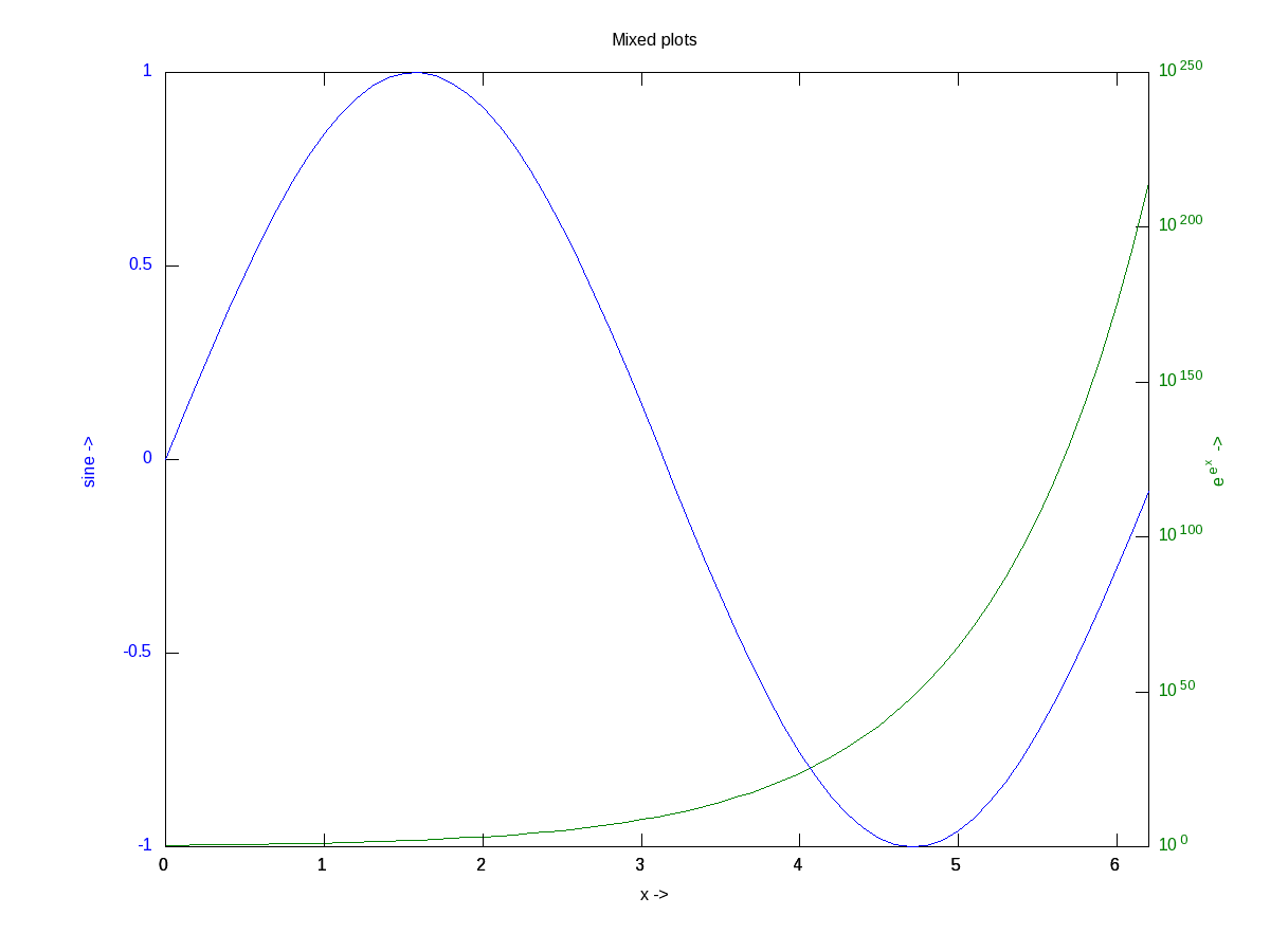
Figure 16: Mixed plots with semi log axis
3D Visualization
And finally, let’s do some 3-D plotting. plot3() is the simplest octave function to do a simple 3-D drawing, taking the set of (x, y, z) points. Here’s the sample code to draw the dwindling sinusoidal curve shown in Figure 17:
octave:1> x = -10:0.1:10;
octave:2> y = 10:-0.1:-10;
octave:3> z = x .* sin(x - y);
octave:4> plot3(x, y, z, "-", "LineWidth", 4);
octave:5> xlabel("x ->");
octave:6> ylabel("y ->");
octave:7> zlabel("z ->");
octave:8> title("Dwindling sinusoidal");
octave:9> grid("on");
octave:10>
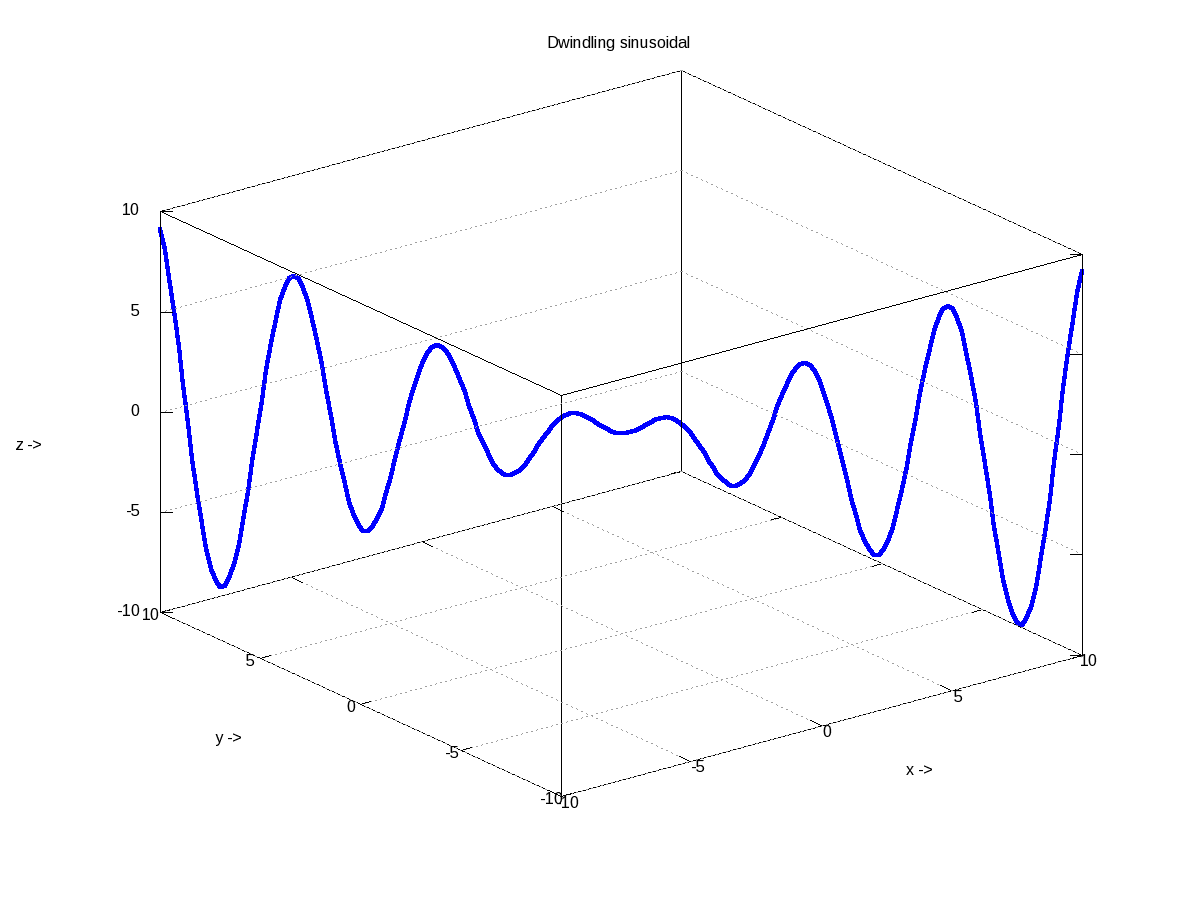
Figure 17: 3-D plot of a dwindling sinusoidal
In case, we want to plot the values of a 2-D matrix against its indices (x, y), it could be done using mesh(), one of the many other 3-D plotting functions. Figure 18 shows the same, created using the following code:
octave:1> x = 0:0.1:2*pi;
octave:2> y = 0:0.1:2*pi;
octave:3> z = sin(x)' * sin(y);
octave:4> mesh(x, y, z);
octave:5> xlabel("x ->");
octave:6> ylabel("y ->");
octave:7> zlabel("z ->");
octave:8> title("3-D waves");
octave:9>
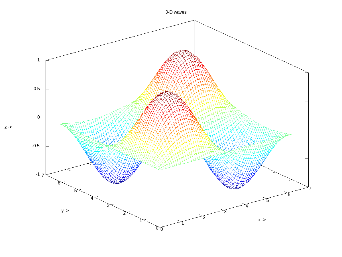
Figure 18: 3-D waves
What’s next?
Hope you enjoyed the colours of drawing. Next, we would look into octave from a statisticians perspective.