This twelfth article of the mathematical journey through open source, shows the mathematical visualization in octave.
Mathematics is incomplete without visualization, without drawing the results, and without plotting the graphs. octave uses the powerful gnuplot as the backend of its plotting functionality. And in the frontend provides various plotting functions. Let’s look at the most beautiful ones.
Basic 2D Plotting
The most basic plotting is using the plot() function, which takes the Cartesian x & y values. Additionally, you may pass, as how to plot, i.e. as points or lines, their style, their colour, label, etc. Supported point styles are: +, *, o, x, ^, and lines are represented by -. Supported colours are: k (black), r (red), g (green), b (blue), y (yellow), m (magenta), c (cyan), w (white). With this background, here is how you plot a sine curve, and Figure 12 shows the plot.
$ octave -qf
octave:1> x = 0:0.1:2*pi;
octave:2> y = sin(x);
octave:3> plot(x, y, "^b");
octave:4> xlabel("x ->");
octave:5> ylabel("y = sin(x) ->");
octave:6> title("Basic plot");
octave:7>
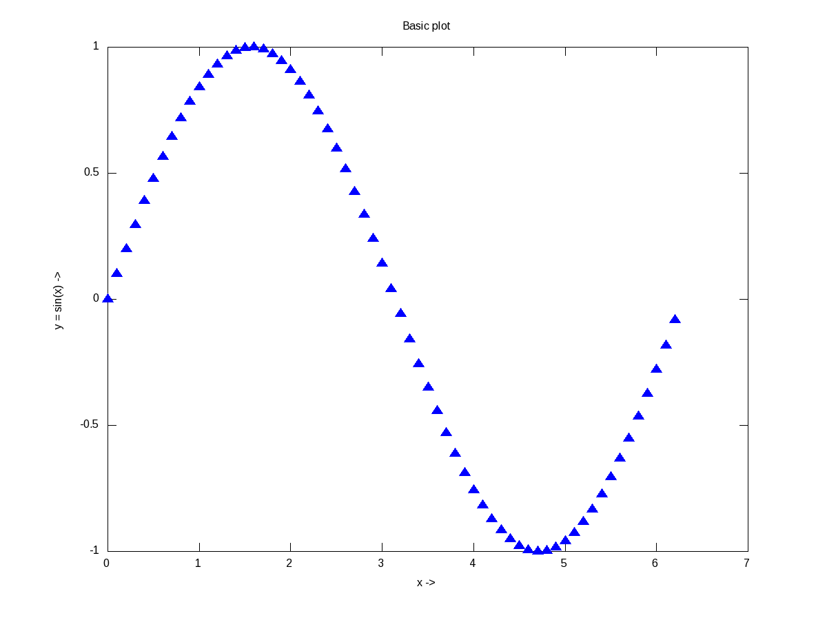
Figure 12: Basic plotting in octave
xlabel(), and ylabel() adds the corresponding labels, and title() adds the title. Multiple plots can be done on the same axis as follows, and Figure 13 shows the plots. Note the usage of legend() to mark the multiple plots.
$ octave -qf
octave:1> x = 0:0.1:2*pi;
octave:2> plot(x, sin(x), "*", x, 1 + sin(x), "-", x, cos(x), "o");
octave:3> xlabel("x ->");
octave:4> ylabel("y ->");
octave:5> legend("sine", "1 + sine", "cosine");
octave:6> title("Multiple plots");
octave:7>
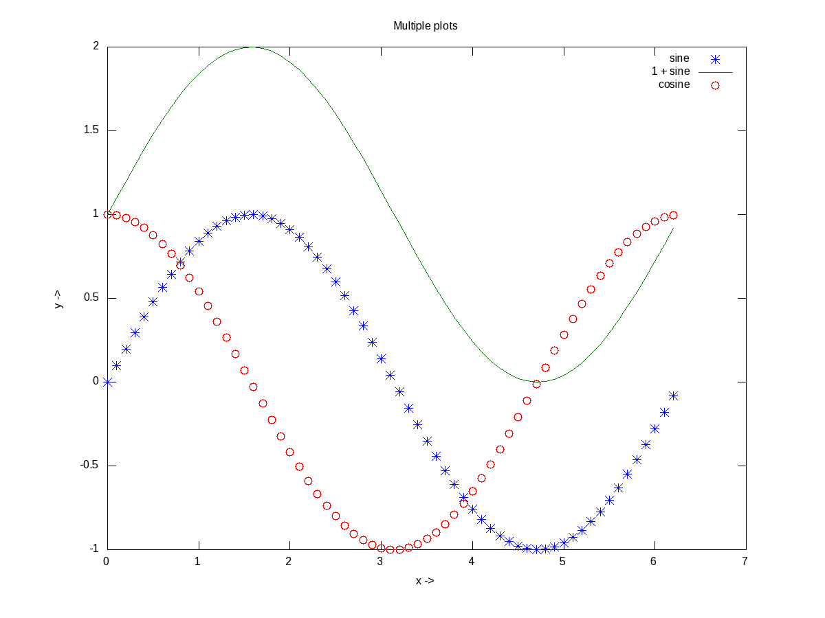
Figure 13: Multiple plots on the same axis
Advanced 2D Figures
Now, if we want to have the multiple graphs on the same sheet but with different axes as shown in Figure 14, here is how to do that:
octave:1> t = 0:0.1:6*pi;
octave:2> subplot(2, 1, 1);
octave:3> plot(t, 325 * sin(t));
octave:4> xlabel("t (sec)");
octave:5> ylabel("V_{ac} (V)");
octave:6> title("AC voltage curve");
octave:7> grid("on");
octave:8> subplot(2, 1, 2);
octave:9> plot(t, 5 * cos(t));
octave:10> xlabel("t (sec)");
octave:11> ylabel("I_{ac} (A)");
octave:12> title("AC current curve");
octave:13> grid("on");
octave:14> print("-dpng", "multiple_plots_on_a_sheet.png");
octave:15>
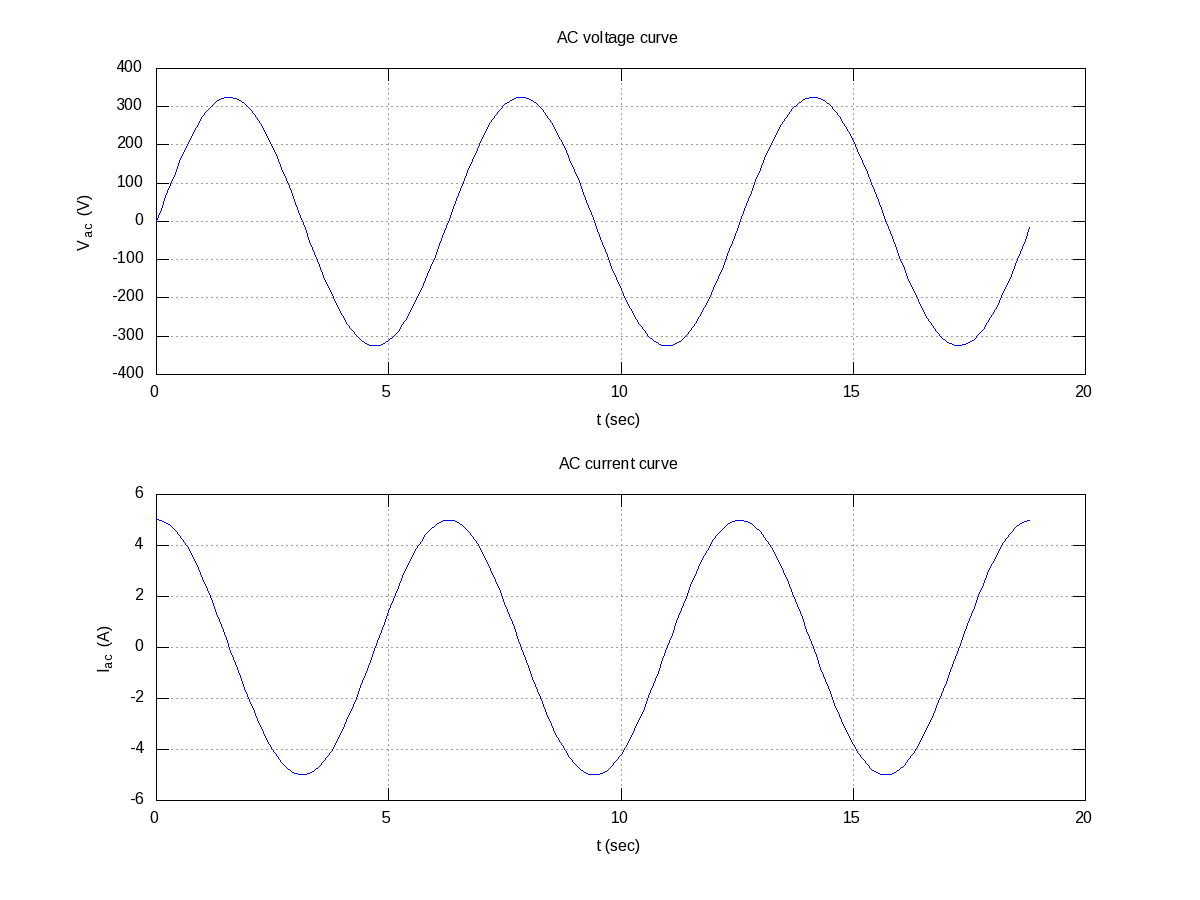
Figure 14: Multiple plots on a sheet
Note the usage of subplot(), taking the matrix dimensions (row, column) and the plot number to create the matrix of plots. In the example above, it created a 2×1 matrix of plots. As add-ons, we have used the grid(“on”) to show up the dotted grid lines, and print() to save the generated figure as a .png file.
It is not always easy to plot everything in Cartesian co-ordinates, or rather many things are easier to plot in polar co-ordinates, e.g. a spiral, circle, heart, etc. The following code & Figure 15 shows a few such examples. Shown along with is a technique of modifying the figure properties, after drawing the figure using the set() function. Here it modifies the line thickness.
octave:1> th = 0:0.1:2*pi;
octave:2> r1 = 1.1 .^ th;
octave:3> r2 = 7 * cos(th);
octave:4> r3 = 5 * (1 - cos(th));
octave:5> r = [r1; r2; r3];
octave:6> ph = polar(th, r, "-");
octave:7> set(ph, "LineWidth", 4);
octave:8> legend("spiral", "circle", "heart");
octave:9>
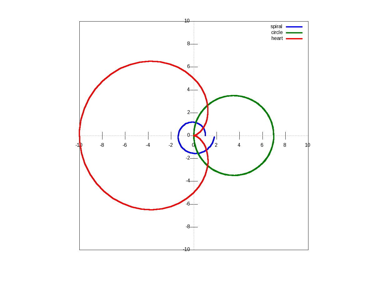
Figure 15: Polar plots
There are many other possible ways of drawing various interesting 2-D figures for all kind of mathematical & scientific requirements. So, before closing on 2-D plotting, let’s look into just one more often needed drawing – plotting with log axis, and more over with two y-axes on a single plot. The function for that is plotyy(). Note the plotyy() calling the corresponding function pointers @plot, @semilogy passed to it, in the following code segment. Figure 16 shows the output.
octave:1> x = 0:0.1:2*pi;
octave:2> y1 = sin(x);
octave:3> y2 = exp(exp(x));
octave:4> ax = plotyy(x, y1, x, y2, @plot, @semilogy);
octave:5> xlabel("x ->");
octave:6> ylabel(ax(1), "sine ->");
octave:7> ylabel(ax(2), "e^{e^x} ->");
octave:8> title("Mixed plots");
octave:9>
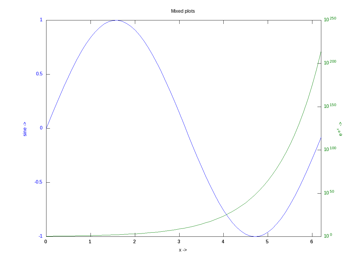
Figure 16: Mixed plots with semi log axis
3D Visualization
And finally, let’s do some 3-D plotting. plot3() is the simplest octave function to do a simple 3-D drawing, taking the set of (x, y, z) points. Here’s the sample code to draw the dwindling sinusoidal curve shown in Figure 17:
octave:1> x = -10:0.1:10;
octave:2> y = 10:-0.1:-10;
octave:3> z = x .* sin(x - y);
octave:4> plot3(x, y, z, "-", "LineWidth", 4);
octave:5> xlabel("x ->");
octave:6> ylabel("y ->");
octave:7> zlabel("z ->");
octave:8> title("Dwindling sinusoidal");
octave:9> grid("on");
octave:10>
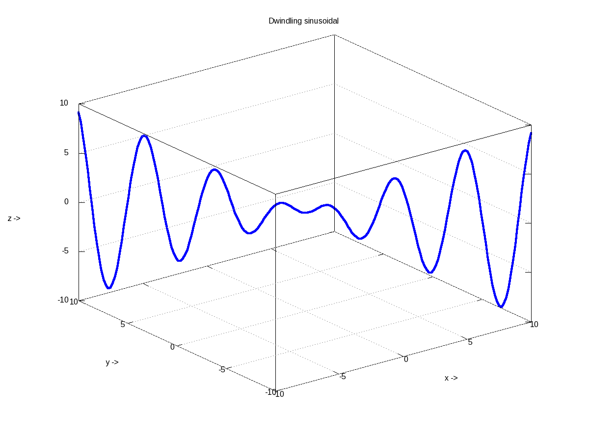
Figure 17: 3-D plot of a dwindling sinusoidal
In case, we want to plot the values of a 2-D matrix against its indices (x, y), it could be done using mesh(), one of the many other 3-D plotting functions. Figure 18 shows the same, created using the following code:
octave:1> x = 0:0.1:2*pi;
octave:2> y = 0:0.1:2*pi;
octave:3> z = sin(x)' * sin(y);
octave:4> mesh(x, y, z);
octave:5> xlabel("x ->");
octave:6> ylabel("y ->");
octave:7> zlabel("z ->");
octave:8> title("3-D waves");
octave:9>
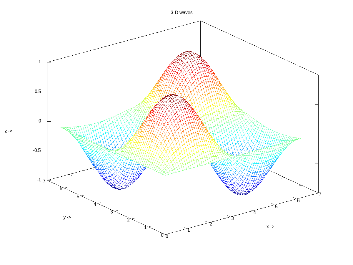
Figure 18: 3-D waves
What’s next?
Hope you enjoyed the colours of drawing. Next, we would look into octave from a statisticians perspective.
The author is a hobbyist in open source hardware and software, with a passion for mathematics, and philosopher in thoughts. A gold medallist from the Indian Institute of Science, Linux, mathematics and knowledge sharing are few of his passions. He experiments with Linux and embedded systems to share his learnings through his weekend workshops. Learn more about him and his experiments at https://sysplay.in.


Pingback: Polynomial Curve Fitting & Interpolation | Playing with Systems
Pingback: Octavian Statistics | Playing with Systems
Thank you, Anil,
I would like to eliminate the gridlines on the plot and see–and save–just color information.
From advice elsewhere, I tried separately:
surface(x,y,z,’linestyle’,’none’), shading(‘interp’), colormap(gray);
surface(x,y,z,’edgecolor’,’none’), shading(‘interp’), colormap(gray);
(because I really only want intensities) and both do result in plots which visually do not show
visible lines between the values of the mesh. (I understand that the ‘interp’ shading interpolates missing values).
However, when I “Save-as” the result as a ‘png’, the image always contains residual evidence of the lines.
Also, if I may, is there a way to lock the aspect ratio of resulting plots? Despite the fact that my x,y values are symmetric, the plots are always over a rectangular grid, instead of square.
David, I am getting it perfectly fine. Just try “graphics_toolkit(“gnuplot”);”, the first thing when you start octave, and then do your drawings, prints, etc. Let us know, if it helps.
Regarding the aspect ratio, you may try pbaspect() for plot box and daspect() for data. Without parameter, they return the current corresponding aspect ratios. With a 3-D vector, they change the corresponding aspect ratios.
sir, I have following code, The values of displ in stage1 and stage2 are plotted in displ vs time graph. Thus a single curve is obtained.
displ=zeros(100,2)
tim=zeros(100,1)
for i=2:100
v=5;
dt=1*10^-4;
function [displ_f]=stage1(displ_i)
dt=1*10^-4;
v=5;
displ_f=displ_i+v*dt;
endfunction
function [displ_f]=stage2(displ_i)
dt=1*10^-4;
v=5;
displ_f=displ_i+v*dt;
endfunction
if (displ(i-1,1)=0)
disp(“IN stage 1”);
[displ(i,1)]=stage1(displ(i-1,1));
displ(i,2)=v;
tim(i,1)=tim(i-1)+dt;
elseif (displ(i-1,1)>=0.020 && displ(i-1,1)==0)
disp(“IN stage 2″);
[displ(i,1)]=stage2(displ(i-1,1));
displ(i,2)=displ(i-1,2);
tim(i,1)=tim(i-1)+dt;
end
end
disp(” displ vs tim”)
plot(tim(:,1),displ(:,1));
How will I get stage1 curve in orange color and stage2 curve in blue color in the same plot to know which stage has which displ values? kindly help me.
You may have to draw them as two separate curves.
BTW, I am not getting any curve from your above program.
Hello.I am new to Octave.Would like to plot the rear suspension in 3D.not sure how to do that.I am a 61 year old. Please need help.Thanks
Do you have the mathematical equation of the same? If yes, plug it in, as per the above examples.
Hi Anil,
Firstly thank you for this post,
I have a doubt, regarding the syntax, as i am facing an error (Octave 6.1.0 on Ubuntu)
Here is what i am trying to do:
%Plot the positive and negative examples on a
% 2D plot, using the option ‘k+’ for the positive
%examples and ‘ko’ for the negative examples.
% here is how the X looks :- 34, 56 and y looks as only: 0/1 both X and y have the same no of rows
pos = find(y==1);
neg = find(y==0);
plot(X(pos,1),X(pos,2),’k+’,’LineWidth’,2,’MarkerSize’,7);
plot(X(neg,1),X(neg,2),’ko’,’MarkerFaceColor’,’y’,’MarkerSize’,7); %If i take out the ‘MarkerFaceColor’ part %then its doing what its supposed to, i referred to the docs, the way i understood it represents the %syntax as plot (x, [y,] FMT, …) I am confused about the [y, ] part and to what arguments the FMT part %applies to, is there a problem with my code or the ‘MarkerFaceColor’ property has a problem as when i add that part in it plots the ‘neg’ points twice once in yellow and then again exchanges the axes and plots them again without the color, also it erases my ‘pos’ points
title(‘Figure 1:Scatter plot of training data’);
xlabel(‘Exam 1 Score’);
ylabel(‘Exam 2 Score’);
legend(‘Admitted’,’Not Admitted’);
All other things seem to be okay, except that the two plot calls should be merged into one to have both the +ve & -ve plots on the same graph. Something like: plot(X(pos, 1), X(pos, 2), ‘k+’, ‘LineWidth’, 2, ‘MarkerSize’, 7, X(neg,1), X(neg,2), ‘ko’, ‘MarkerFaceColor’, ‘y’, ‘MarkerSize’, 7);
Hello, Anil,
First, I want to thank you for these great examples of plotting technique. I am an elderly engineer with many years of computing experience, but still new to Octave. I found many helpful items in your examples, all of which I have converted to .m files. Two questions remain, howeever:
1) Is there a way to get larger numbers on the axes? They are so very small in the default setting.
2) Is there a way to enlarge the type face used for axis labels and the title?
3) Each of my .m files runs the first times it try to execute it, but a second execution gives not plot at all. I presumee I need to clear the previous plot in some way, but how?
4) My .m file for Fig16 (given below) mostly looks like your example, but it generates a lot of squiggles on the right edge in a tan color. Do you see the problem?
Thanks,
% Fig16.m
% From Octave examples by Anil Kumar Pugalia
x = 0:0.1:2*pi;
y1 = sin(x);
y2 = exp(exp(x));
ax = plotyy(x, y1, x, y2, @plot, @semilogy);
xlabel(“x ->”);
ylabel(ax(1), “sine ->”);
ylabel(ax(2), “e^{e^x} ->”);
title(“Mixed plots”);
1 & 2) With Octave 3.8.2 or above, you may try something like set(gca, “linewidth”, 4, “fontsize”, 12)
3) See if your previous plot window is still open. You may have to close it
4) A screenshot of the issue could have helped to analyze